Rasa
Brand assets and design patterns for SCHE
About
The Sambodh Center for Human Excellence is an ashram and non-profit organisation dedicated the teachings of Advaita Vedanta and meditation. It is guided under the direction of our guru, Swami Bodhananda Sarasvati.
Rasa is Sambodh's design system, which focuses on providing a set of assets and patters to help us maintain a consistent look and feel across our various platforms. Rasa emphasises simplicity, productivity, and beauty. We have also chosen to open-source it to allow the community to build their own projects using our foundation.
Usage
In general, please do not use the Sambodh name or logo in any way that may be misleading, or suggest our sponsorship, endorsement, or affiliation. For questions, write to us at thesambodhsociety@gmail.com.
Promotional
Please email us before using the Sambodh logo on websites or products—including but not limited to: books, manuals, newsletters, packaging, etc.
Name and Logo
Do not use “Sambodh” as a part of your name. Do not incorporate the Sambodh logo into yours. Do not use a domain or email name containing “Sambodh”.
Reference
For address references, use the name "The Sambodh Center for Human Excellence". For links, use the name “Sambodh” and refer to our URL as “sambodh.us”.
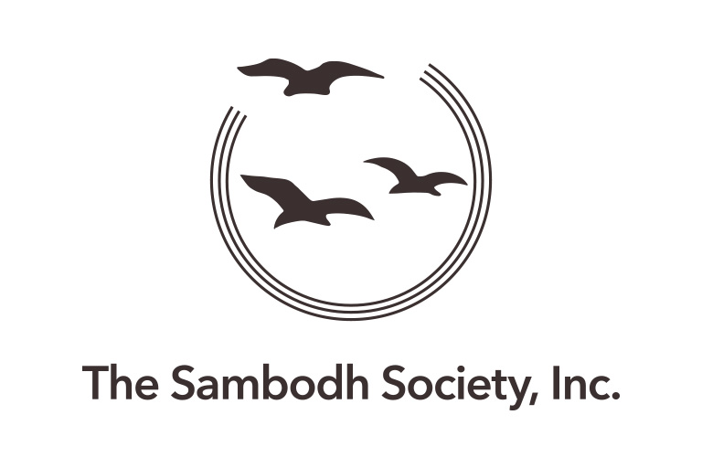
Logo
“The logo is made of three semicircles with two birds trapped in and one bird flying out. The three circles represent the three bodies/three gunas/three states of consciousness. The two birds represent the seeker and the sought after. Actually, they are one. Not knowing this the seeker goes into a wild goose chase. Finally, when the seeker realises that he/she is seeking himself/herself the two birds become one and gets out of the circles into the wider expanse of boundless consciousness—bliss.”
— Swami Bodhananda Sarasvati
Solid and Full Color Logo
Use our solid and full color logo when the context of Sambodh is clear. Keep at least 25% of whitespace around our logo on each side. No additional text or graphical elements may occupy this space.
Solid Logo
Download Logo Kit →Full Color Logo
Download Logo Kit →Logotype
When Sambodh is represented on third-party sites or amongst third-part logos, use the stroke or the full color logotype.
Stroke Logotype
Download Logo Kit →
Full Color Logotype
Download Logo Kit →Color
Our logo is composed of the primary colours of yellow, red and blue—signifying the entire realm of matter. On a subjective level, yellow represents one who is influenced by light; red, motion; and blue, the quality of mass. A set of varying shades have been derived from these three colours to create a natural palette for digital and print usage. In general, yellow is the primary colour of the Sambodh brand. Red is both used as a way to highlight a feature or link.
Light Gold
#ffdaa9
Gold
#f9a523
Dark Gold
#ce8017
Black
#3c3131
Light Vermillion
#ffcfcf
Vermillion
#e25d52
Dark Vermillion
#a01a13
Slate
#958d8d
Light Blue
#dce9ff
Blue
#263c81
Dark Blue
#1d2842
Snow
#f1eaea
Type
Font Families
Our two primary font families are Poppins and Palatino. We use Poppins for most headlines and Palatino for larger bodies of text. Poppins is an open source typeface designed by the Indian Type Foundry. We appreciate the support it provides for the Devanagari and Latin writing systems.
Poppins
a b c d e f g h i j k l m n o p q r s t u v w x y z A B C D E F G H I J K L M N O P Q R S T U V W X Y Z
Palatino
a b c d e f g h i j k l m n o p q r s t u v w x y z A B C D E F G H I J K L M N O P Q R S T U V W X Y Z
Type Scale
For our digital platforms, we use a type scale to create and design easily readable interfaces. It is a simple ratio-based scale with eight options.
| A | A | A | A | A | A | A | A |
| 6rem (96px) | 5rem (80px) | 3rem (48px) | 2.25rem (36px) | 1.5rem (24px) | 1.25rem (20px) | 1rem (16px) | .875rem (14px) |
Contact
If you have any questions about the Sambodh brand, please get in touch by emailing thesambodhsociety@gmail.com.